I’ve been talking about article social networks for a while, and last August I wrote ‘Beauty is in the eye of the beholder‘ which contained the image below.
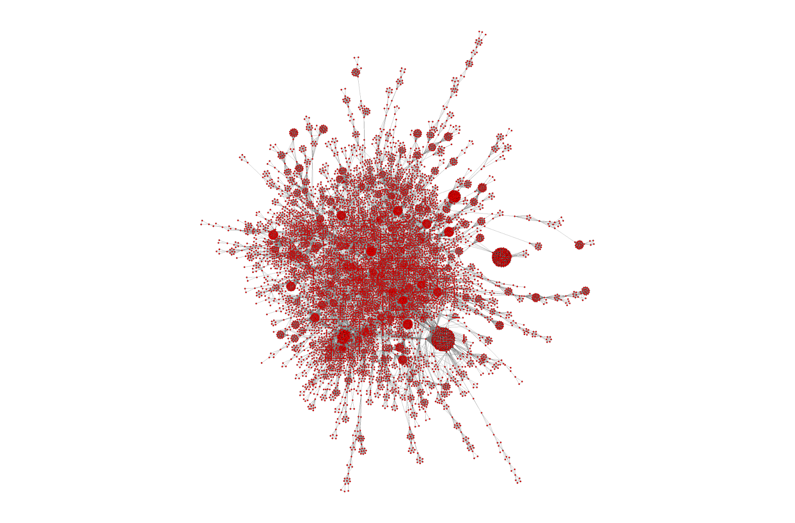
I’ve continued to be fascinated by them and below are two more images – focused on defined areas of the above graph
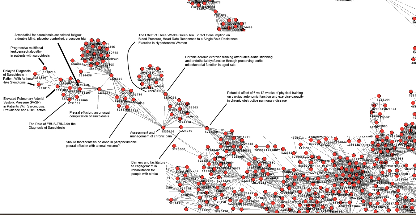
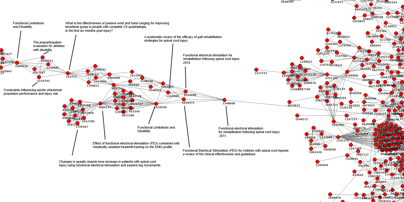
These are beautiful – but is there more to it?
Both images show definite structure. So, our users, simply by using the site are adding structure and energy. I keep getting drawn to the principle of entropy. I’m absolutely sure that our users are ordering the articles in Trip but does that have any value?
I admit to being relatively clueless – part of the purpose of the post is to see if the wisdom of the Trip users can be brought to bear to try and help me figure out what the above might mean and what might the next steps be!
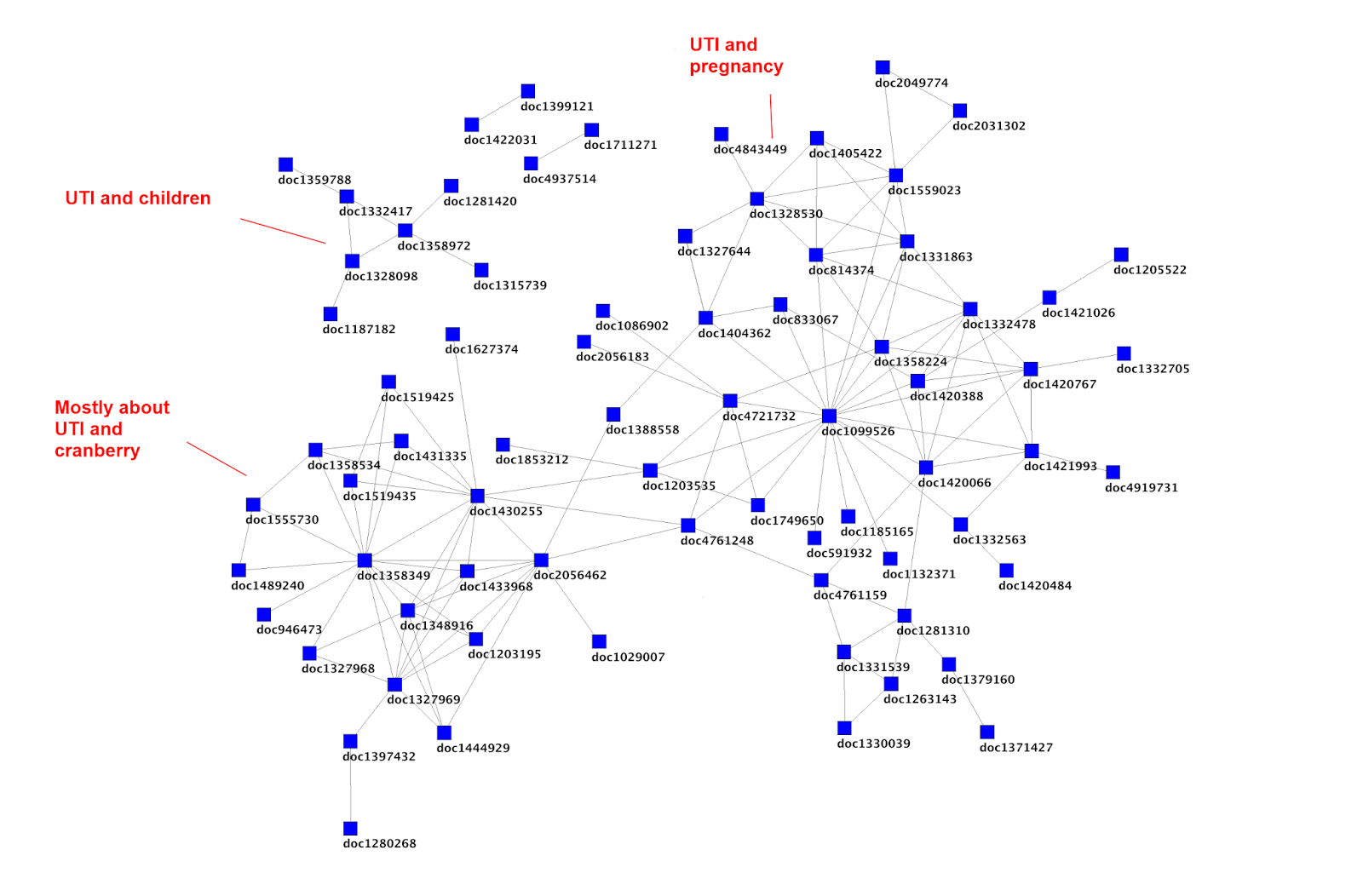
The above image (taken from Article social networks, meaning and redundancy) shows distinct clusters as well. In the bottom left is a cluster of articles on UTI and cranberry and it consists of 19 articles. If you do a search of Trip you find many more than this. So, our users are not clicking on many articles – so as well as adding structure are they giving us clues as to articles that aren’t worthwhile (based on their collective judgements)?
If you click on one article in that cluster, is it likely that the others will be worthwhile? What about if a new article is published and joins the cluster based on another person searching and effectively adding the article to the cluster – is that useful? I’m sure there are no absolutes, but these appear to be hints – surely?
A final thought – the graphs are based on all users. I imagine the above graph would look different if the user had been a general/family practitioner compared with, say, a urologist. Stronger clues?
I would be absolutely delighted if anyone can help me figure out the value/meaning of the data. And, if you can think of ways of working together I’d be delighted to see how we can share the data!

January 6, 2015 at 9:25 am
This reminds me of a book I bought in a book shop in Ely, Information is Beautiful by David McCandless. He's on twitter facebook etc you may get some ideas there.
LikeLike
January 6, 2015 at 2:00 pm
It'd be interesting to look deeper into the papers which users choose to look at and those they don't – do they share characteristics e.g. study type? or similar results (do we tend to select papers which reinforce our beliefs/bias?)
LikeLike
January 6, 2015 at 2:54 pm
Hi, your post was forwarded to me by a friend because I looked at more or less this same problem a few years ago. These patterns are certainly beautiful, but I think also very meaningful. They reflect rich contextual information emerging from details, like bottom-up semantics, even if that sometimes reflects confusion. In my case, I used the clustering and the dynamic links to simply generate an emergent 'reference list' and an emergent list of keywords/tags for each object, helping to provide some context which is usually the missing ingredient for information. These emergent paths & keywords would be followed/used or not, and would amplify or decay accordingly. People would develop surprising & novel connections, objects would develop complicated lives and all this helped to enrich the information. I did try some interactive visualisations too, although there are some serious challenges there in making it easy to use I think. I come at it from a 'self-organisation' point of view, thinking in terms of arranging +ve & -ve feedbacks, so perhaps that might help.
LikeLike
January 6, 2015 at 5:12 pm
Hi Gav, I'd like to learn more about what you've done/considered. Can you email me to start a dialogue? BW, jon (jon.brassey@tripdatabase.com)
LikeLike