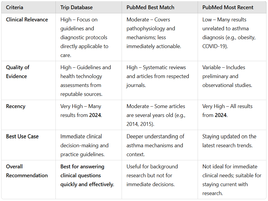
This is the second in our series comparing Trip to PubMed, the first can be seen here. Last time we explored prostate cancer screening, while this time it is for the search asthma diagnosis.
For Trip we used the default Pro search and for PubMed we will show the top 5 results for both their ‘Best match’ algorithm and ‘Most recent’.
We then took the top ten results for each of the three different searches and asked ChatGPT to compare the results exploring issues like clinical relevance, quality of the evidence and recency. ChatGPT’s response was:
The roll out of the synonym system, yesterday, is already proving beneficial.
Before we didn’t have a synonym for surgery, so we will now add surgical!
surgery – 578,100 results
surgical – 407,425 results
surgical OR surgery – 779,828 results
It does raise interesting questions about how strict we make the synonyms. One could argue that surgery and surgical are not strict synonyms as they can be used slightly differently. But the overlap seems large enough to warrant it!
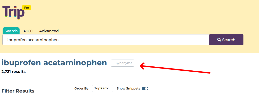
Two weeks ago we announced a raft of design changes, today is a more modest update. It relates to being transparent about the synonyms we use in Trip. Until now it has never been possible to see what synonyms we used. Well, from now you can see and also comment.
When you do a search there is a subtle Synonyms box:
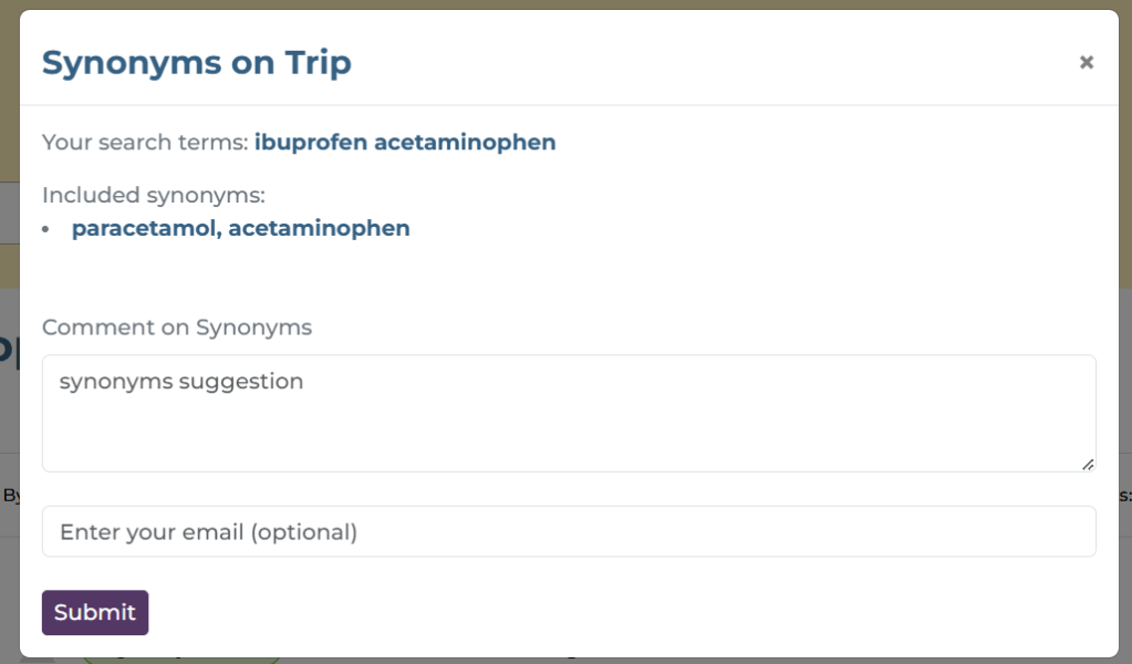
If you click on the box it shows the synonyms used in the search:
In this case we can see that we used the synonym acetaminophen for paracetamol.
You’ll also notice a Comments section. If you use Trip and you feel the current synonyms are poor then let us know. Similarly, if there is no synonym and you think there should be, then also let us know. Your input can help make Trip better for you and for other users.
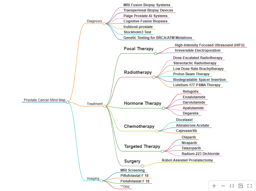
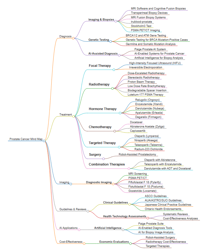
We’re interested in allowing users to create topic maps for a search. We have tried this ‘mind map’ approach for a search for prostate cancer. There are two examples below, the first based on the top 100 search results and the second on the top 300 results.
I think these are really interesting, giving users an instant overview of the topic. I dare say it could be used for search refinement. By that, start with a broad search and then decide to focus on diagnosis or focal therapy…
We’ve just rolled out some big and some little design changes.
Above the search results:
‘Order By’ has been changed to TripRank, previously it was quality. ‘Quality’ was mis-leading as the default algorithm takes into account quality, date and relevancy. TripRank better reflects this.
‘Show Results’ now allows users to select 20, 50 or 100 results on the page. Previously users were only able to see 20 results on a single page.
‘Results page key’ now opens up within the same window – as a modal – previously it opened up in a new window.
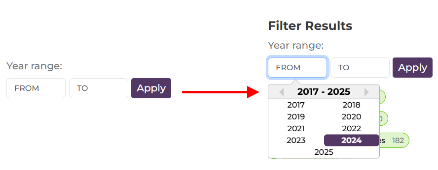
Date Range:
Clearly labelled and when a user clicks in the ‘From’ or ‘To’ box there is a drop-down selection (although users can still simply type the year)
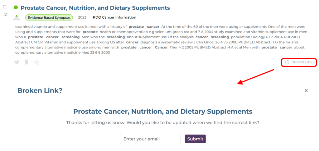
Broken link:
Currently, when a user clicks the ‘Broken link?’ button they get a simple ‘thank you’. However, from now users will be able to leave their email so that we can update them when we resolve the issue – likely an updated URL or notification that it has been deleted. This feels really important to me as Trip benefits enormously from these reports, it feels like we’re giving something back directly to the person reporting the issue!
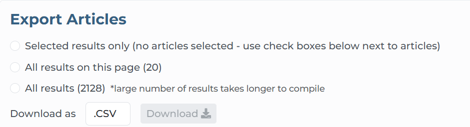
Export articles:
We have slimmed down the export options area and now reads ‘top to bottom’, making the options more logical (a few people have reached out expressing confusion while using this feature):
Accessibility Statement:
This has now been added to the footer
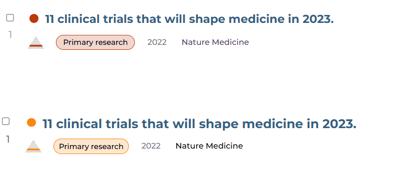
One final, subtle change, and this is in colours for primary research and controlled trials:
At the top was the previous red and beneath is the new orangey/red. Red is associated with danger so seeing lots of reds seemed quite negative (and I felt it looked a bit angry). The orange seems more peaceful.


Recent Comments