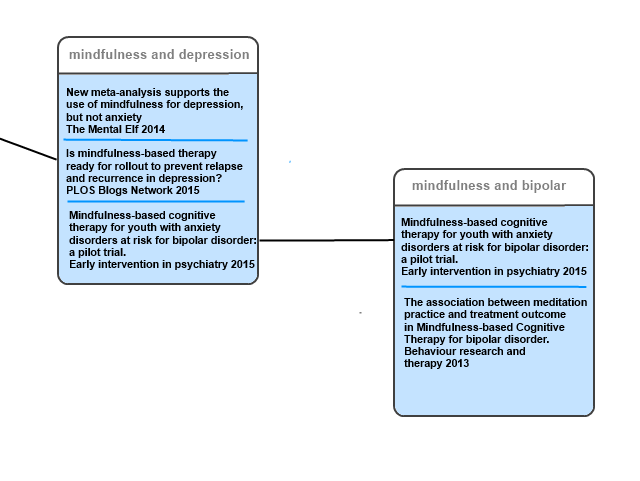
In my previous post Ok, I admit it, I’m stuck (a title people seem to really like) I highlighted the difficulty in finding meaning in our clickstream data (the data generated by users interacting with the site). One thing that I had thought about and a couple of people have subsequently raised is an Amazon style ‘People who looked at this article, also looked at this one..’, a feature I find really interesting and frequently useful.
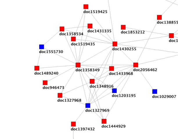
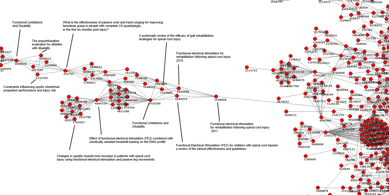
So, taking some earlier work on mapping UTI data I started doing further analysis but it was based on this graph.
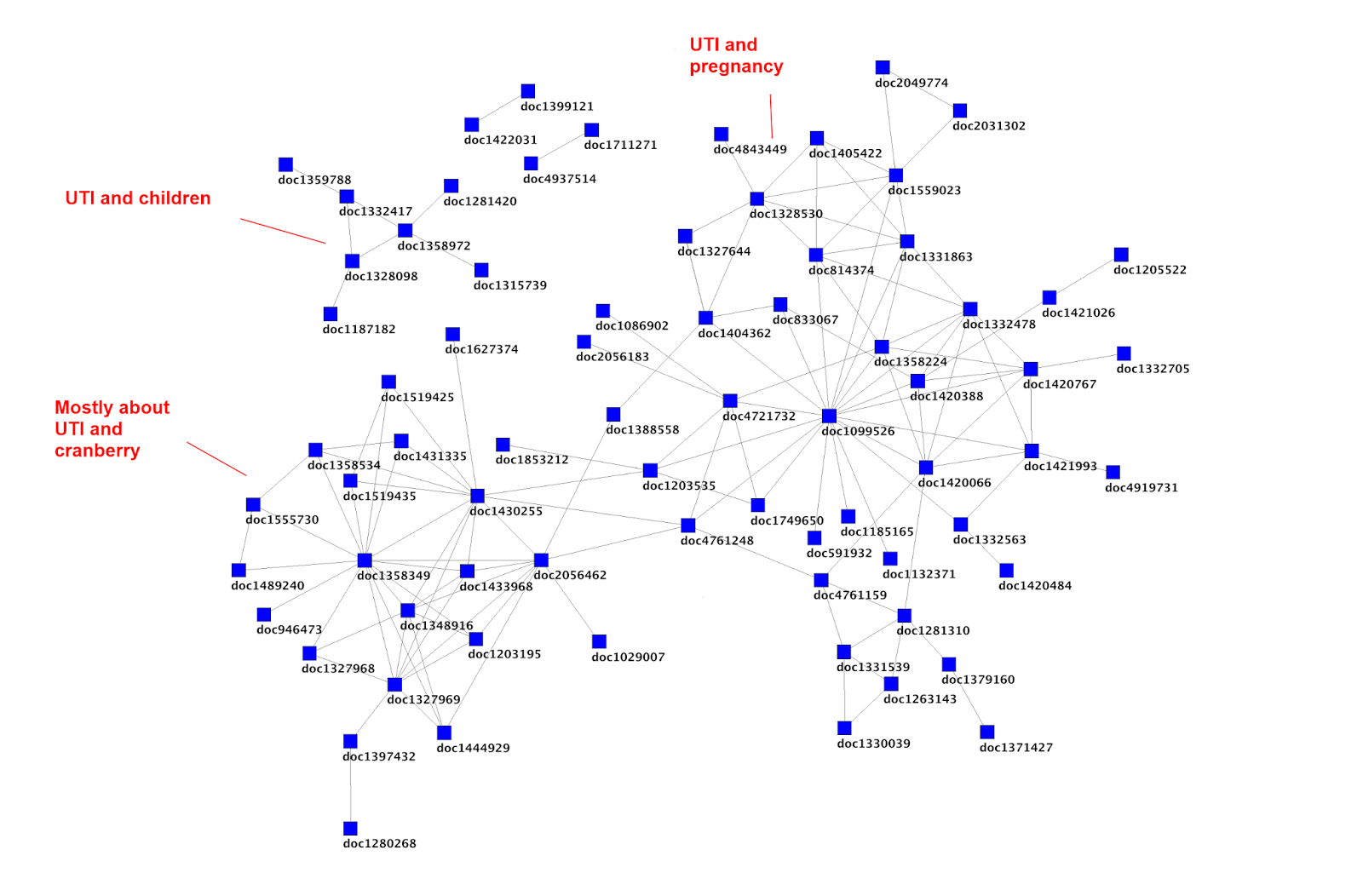
I started with an article that looked in an interesting place and picked document 2056462 (Cranberry juice/tablets for the prevention of urinary tract infection: Naturally the best? from the publication Tools for Practice 2013) and then followed the links from there. Some have since been removed or updated. But, we can say that ‘People who looked at Cranberry juice/tablets for the prevention of urinary tract infection: Naturally the best? also looked at…
- Novel Concentrated Cranberry Liquid Blend, UTI-STAT With Proantinox, Might Help Prevent Recurrent Urinary Tract Infections in Women (Urology, 2010)
- Recurrent urinary tract infection and urinary Escherichia coli in women ingesting cranberry juice daily: a randomized controlled trial (Mayo Clinic proceedings, 2012)
- Cranberry is not effective for the prevention or treatment of urinary tract infections in individuals with spinal cord injury (DARE, 2010)
- Cranberries for preventing urinary tract infections (Cochrane Database of Systematic Reviews, 2009)
- Cranberry-containing products for prevention of urinary tract infections in susceptible populations (CRD 2012)
- A randomized clinical trial to evaluate the preventive effect of cranberry juice (UR65) for patients with recurrent urinary tract infection (Journal of infection and chemotherapy, 2013)
- Urinary tract infection (lower) – women (NICE Clinical Knowledge Summaries, 2009)
I then, as a way of snowballing, took the last article in the list and did a similar thing, which results in ‘People that looked at Urinary tract infection (lower) – women also looked at…
- Cranberry juice/tablets for the prevention of urinary tract infection: Naturally the best? (Tools for Practice 2013)
- Urological infections (European Association of Urology, 2013)
- Recurrent Urinary Tract Infection (Society of Obstetricians and Gynaecologists of Canada, 2010)
- A randomized clinical trial to evaluate the preventive effect of cranberry juice (UR65) for patients with recurrent urinary tract infection (Journal of infection and chemotherapy, 2013)
- Urinary tract infection (lower) – men (NICE Clinical Knowledge Summaries, 2010)
Anyway, I hope it’s clear what’s going on! On one level it all seems good and interesting in that all the articles seem relevant. But does it add anything that the initial search wouldn’t have found? To help I’ve gone through the top list and shown where each of the results appears in the search results (coincidentally the Tools for Practice article came 5th in the results list for a search of urinary tract infection and cranberry):
- Novel Concentrated Cranberry Liquid Blend, UTI-STAT With Proantinox, Might Help Prevent Recurrent Urinary Tract Infections in Women (Urology, 2010) = Result #38
- Recurrent urinary tract infection and urinary Escherichia coli in women ingesting cranberry juice daily: a randomized controlled trial (Mayo Clinic proceedings, 2012) = Result #18
- Cranberry is not effective for the prevention or treatment of urinary tract infections in individuals with spinal cord injury (DARE, 2010) = Result #7
- Cranberries for preventing urinary tract infections (Cochrane Database of Systematic Reviews, 2009) = Result #14
- Cranberry-containing products for prevention of urinary tract infections in susceptible populations (CRD 2012) = Result #2
- A randomized clinical trial to evaluate the preventive effect of cranberry juice (UR65) for patients with recurrent urinary tract infection (Journal of infection and chemotherapy, 2013) = Result #13
- Urinary tract infection (lower) – women (NICE Clinical Knowledge Summaries, 2009) = Result #54
To me these results are interesting! The clear ‘outliers’ are the top and bottom results which appeared in result number 38 and 54 respectively. This is important as it means that they are much less likely to be seen – especially the latter one which would be on the third page of results.
Is this useful?
It will highlight different articles than found from browsing the search results, but is there a cost? Will users look less at our algorithmic results (the normal results) and rely on these ‘human’ results? If so, is that good or bad? I actually think it’ll encourage people to explore more and spend longer on the site – so I don’t think it’ll have a negative consequence.
This is really interesting!
I’m really tempted to open a can of worms by asking if there is any coherence/rationality as to how the linked articles list is generated. However, as the above list is based on only a sample of data it’d be wrong to place too much weight on things. Also, even if it is random, so what!?
Finally, I’ve even graphed this out (in not too an appealing way):

 I
I 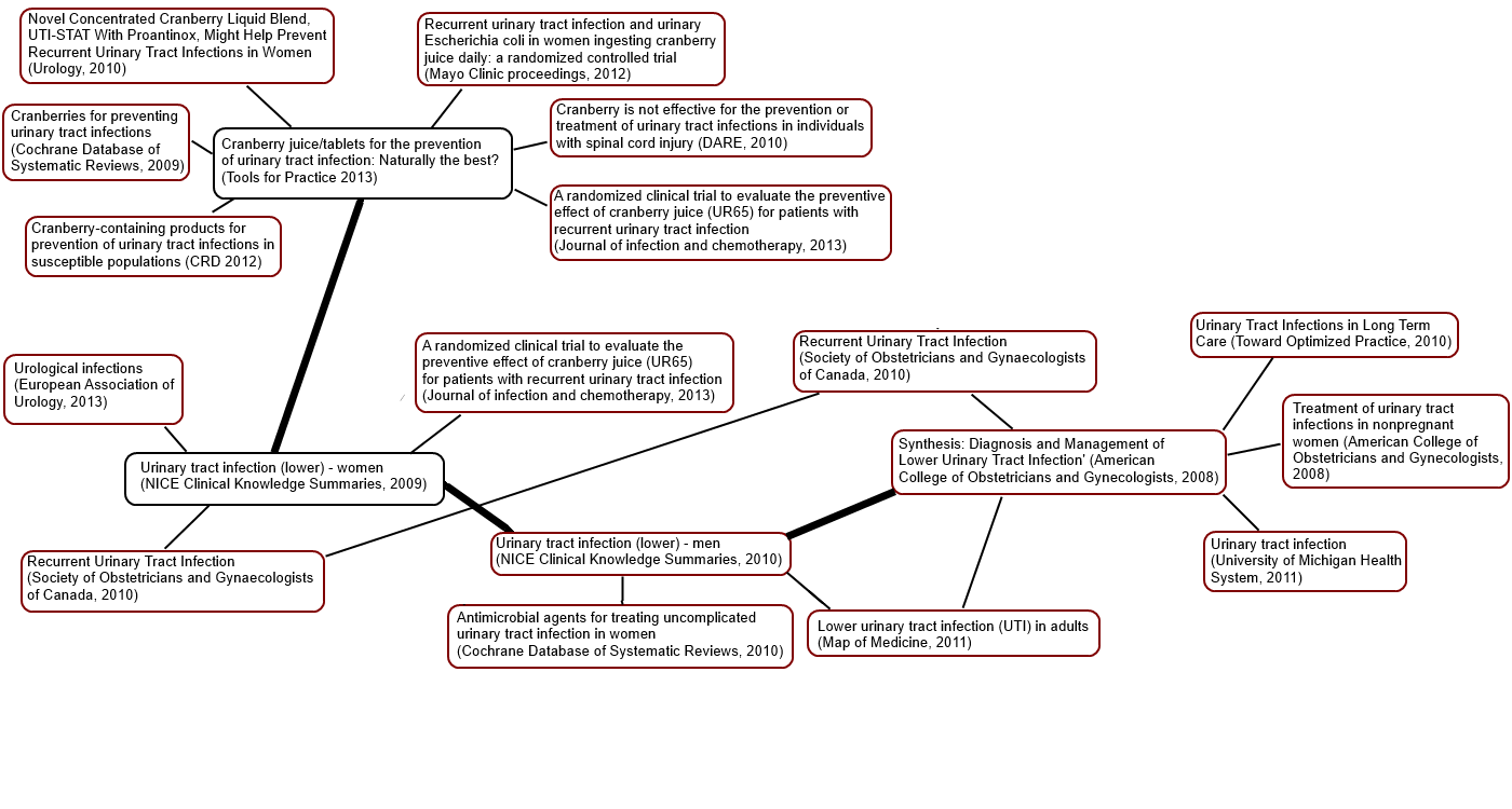


Recent Comments