We’ve just rolled out some big and some little design changes.
Above the search results:

‘Order By’ has been changed to TripRank, previously it was quality. ‘Quality’ was mis-leading as the default algorithm takes into account quality, date and relevancy. TripRank better reflects this.
‘Show Results’ now allows users to select 20, 50 or 100 results on the page. Previously users were only able to see 20 results on a single page.
‘Results page key’ now opens up within the same window – as a modal – previously it opened up in a new window.
Date Range:
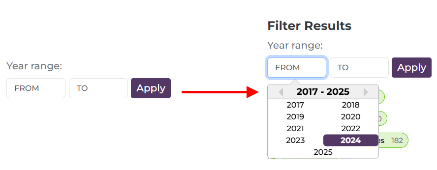
Clearly labelled and when a user clicks in the ‘From’ or ‘To’ box there is a drop-down selection (although users can still simply type the year)
Broken link:
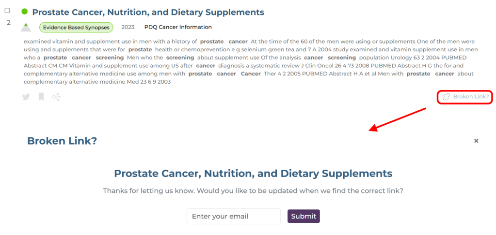
Currently, when a user clicks the ‘Broken link?’ button they get a simple ‘thank you’. However, from now users will be able to leave their email so that we can update them when we resolve the issue – likely an updated URL or notification that it has been deleted. This feels really important to me as Trip benefits enormously from these reports, it feels like we’re giving something back directly to the person reporting the issue!
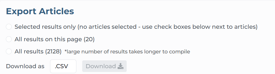
Export articles:
We have slimmed down the export options area and now reads ‘top to bottom’, making the options more logical (a few people have reached out expressing confusion while using this feature):
Accessibility Statement:
This has now been added to the footer
One final, subtle change, and this is in colours for primary research and controlled trials:
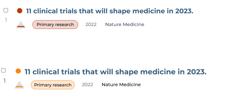
At the top was the previous red and beneath is the new orangey/red. Red is associated with danger so seeing lots of reds seemed quite negative (and I felt it looked a bit angry). The orange seems more peaceful.

2 Pingback