A slightly mis-leading title as it’s actually a new website design that affects all versions of the site – mobile, tablet and PC (it’s a responsive website design). However, the main motivation was to improve the mobile interface that was far from ideal (an understatement). Here’s an example of the old mobile interface (left) and the new (right):
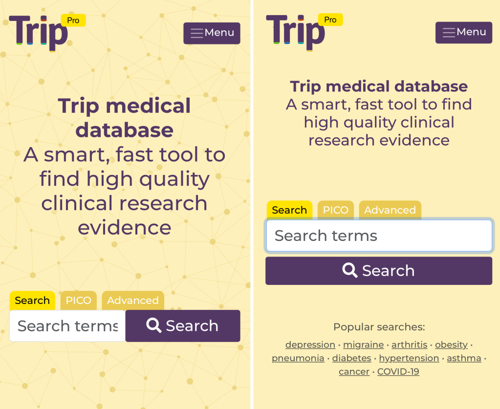
It’s neater, the search box is a decent size and not being cramped by the search button!
Lots of other subtle changes and some big ones. For instance, on the old version if you tried to filter the results (by, say, guidelines) you could end up with the screen looking like this:
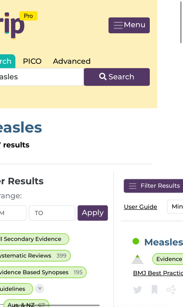
Leaving the user having to swipe to see the results. Now it works really well and behaves as most would expect.
This is not a finished design as there are more change to be made, but it is a great start. I hope you enjoy!
 Trip Database Blog
1 Pingback