Maybe not lots of fun, but I enjoyed doing it! At AskTrip we automatically assign clinical categories and also the strength of evidence used to answer the question. Put these together and you can – fairly – easily see what evidence is used to answer the questions.
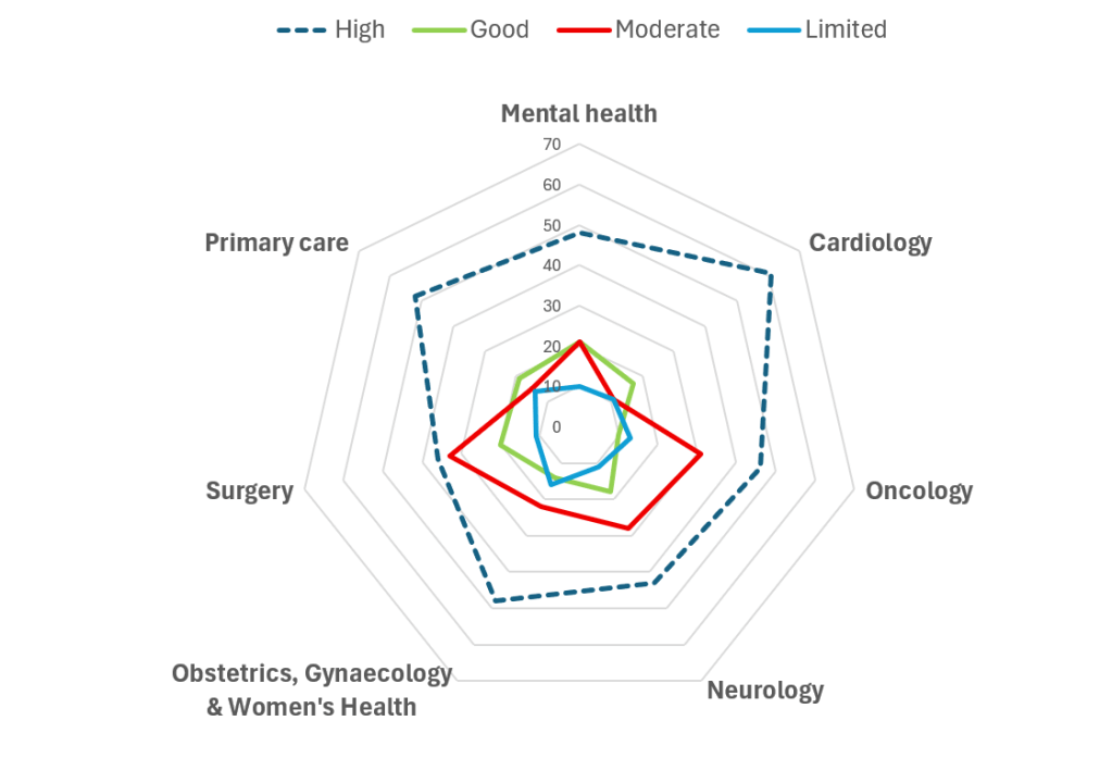
I restricted it to a handful of the clinical areas where we had lots of questions (50+) and I’ve plotted it using two graphs (not sure which is best)
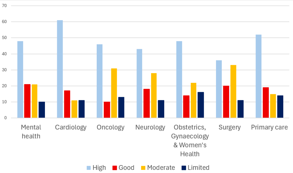
What we can see is that the cardiology questions we received we able to be answered with the most robust evidence (rating of high) and that was 61% (surgery was the worst with 36%)
Surgery and oncology are tied – with 44% – of the questions being answered with lower quality evidence (rating of limited or moderate) with cariology the best 22%
I called it fun as there are all sorts of methodological issues with the analysis – so take it with a pinch of salt…

Leave a comment