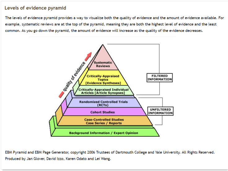
A great explanation of the evidence pyramid (taken from this Walden University site):
We use this concept in Trip to help users navigate the results (helping indicate the likely reliability of the evidence):
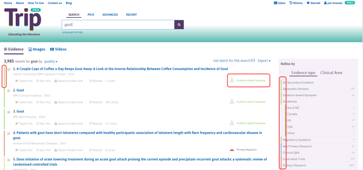
The main place to see it is slightly to the right of the result. Here you see the pyramid, a colour-banded representation of where the evidence lies in the pyramid and a phrase describing the content (e.g. systematic review, guideline etc). You’ll note the colour coding which can be found to the left of each result and it is carried through to the ‘Refine by’ area.
We’ve just had a large usability study of the site and this is what the report states:
- Users from research or information management backgrounds understood the pyramid icon, but users who were new to it wondered what it was.
- When they figured out what it was, or I talked them through it, they appreciated it and it appeared to add to their experience.
- Recommend adding a mouse-over explanation or some kind of ‘Introducing the pyramid of evidence’ box somewhere, as part of onboarding or in help.
Bottom line: it’s useful but only when you know what it means! With no understanding of the concept it’s just confusing.
I need to go and sit on the ‘naughty step’ and contemplate why I fell in to the trap of assuming users know all this sort of stuff (oh yes, and to fix it).

1 Pingback