When users register on TRIP they can record keywords of interest and/or clinical areas of interest. By doing this we send them a monthly email with new content that matches their interests. This information is displayed in the following format (click on image to enlarge):
I’m not a huge fan of this look as I think it’s too complicated. I raised this with Phil (the TRIP techie) and he wasn’t convinced by some of my ideas – so he suggested I ask the users what they thought! The results are below…
When the monthly email arrives from TRIP, do you
- Ignore it – 2%
- Skim read it – 35%
- Follow some of the links – 62%
- I never receive them – 1%
The TRIP emails currently contain links to all new content. We are considering including the “top” 2 or 3 articles in each subject/interest area – highlighting them (title, publication and URL) in the email. What do you think?
- Sounds good, yes please – 77%
- Sounds good, but I’m worried it would make the email too long – 15%
- No thanks, there’s already too much information – 8%
Overall, how would you rate the emails
- Great – 22%
- Good – 56%
- Ok – 17%
- Poor – 5%
- Awful – 0%
What do you most like about the current emails?
- short, infrequent
- They are useful for concise
- They are well-organized and easy to use
- All wanted information is very clear arranged and I can grasp on more details with only one klick.
- Helps me with current awareness derived from a credible source! I often suggest my clients sign up for these emails directly
What do you most dislike?
- tough to see the significance without ANY detail
- Some features didn’t appear to work, specifically, I’ve clicked and chosen some of the links and have tried both the email and the send to rtf file but neither of those features have worked for me.
- Not enough information to help me decide whether to click on links
- Too wordy. Bullet points with links if the item looks interesting
- There is a lot of unrelated information in the links. Articles come up that have nothing to do with the topic.
- No information about the top articles in the emails compels readers to click on the multiple links. If article titles are listed, like Table of Content alerts from Journals, would be more user friendly.
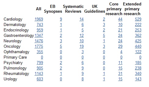
We also asked for additional comments and got a number – including some significant love and fondness for TRIP. A few raised issues of accuracy of the results (an issue we’re aware of an looking into). The issue of primary care content raises it head yet again. The content for the emails is automated and I can think of no way of automatically deciding if an article is suitable for primary care or not.
Overall, it appears that most people are happy with the emails (I’m surprised) but a number would like additional information displayed to give a flavour of the content. In the above example, with 12 interests and over 3,000 links – how do you select 4-5 that give a flavour?
These are all challenges that we need to deal with. Fortunately, as people are broadly happy with the emails there is no huge pressure – so we’ll include it in our next upgrade (in 2-3 months).
But if anyone cares to make a suggest we’d love to hear from you…

Leave a comment