AskTrip was designed primarily to help people answer clinical questions. But a substantial minority of the questions submitted to it are not really about choosing a diagnosis or treatment for an individual patient. They are about how healthcare works: staffing, communication, education, inclusion, ethics, carers, policy and the organisation of services.
We analysed the first 20,000 questions submitted to AskTrip. Using a keyword-and-context classifier, followed by iterative checking to reduce obvious false positives, we identified 2,433 core questions – 12.2% of the total – as primarily non-clinical or systemic. A further 476 questions combined clinical and organisational elements; these were kept separate and are not included in the headline figures below.
The largest theme was not policy or ethics, but how services work
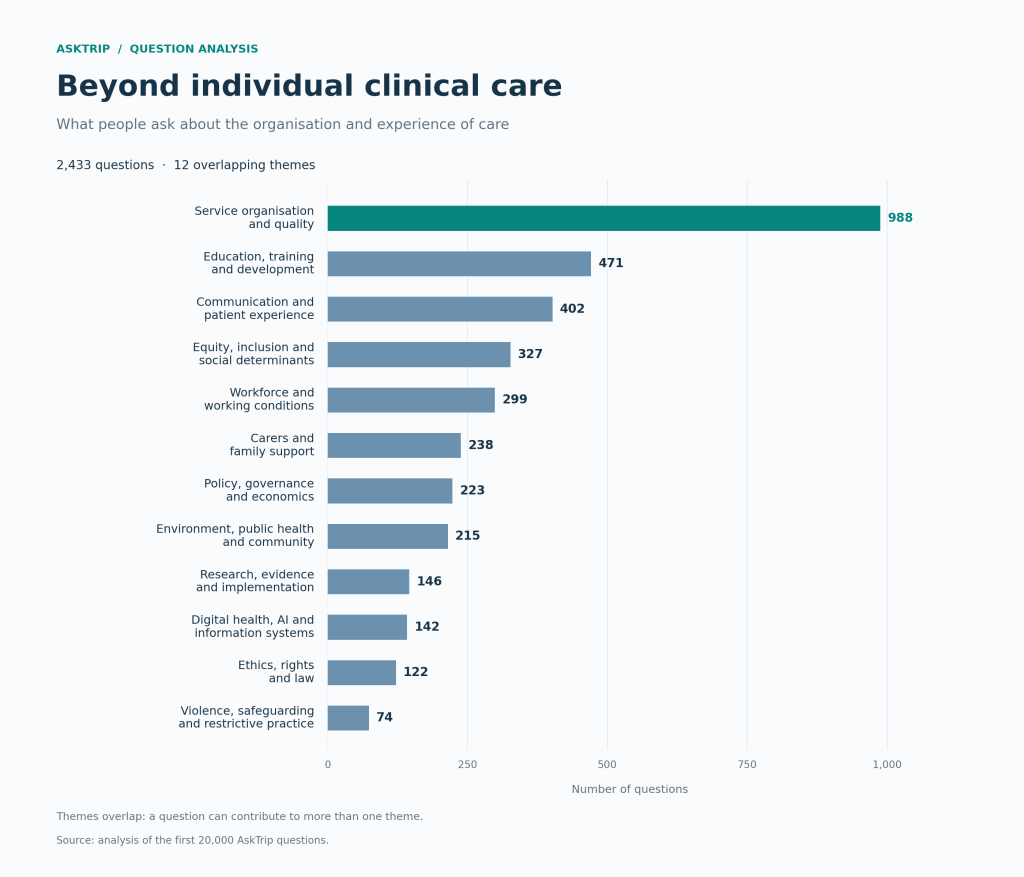
The dominant theme was service organisation and quality, appearing in 988 of the 2,433 core questions. These questions concerned such things as continuity of care, staffing models, care pathways, waiting times, referral systems, missed care and quality improvement.
One question makes the connection particularly clear: “How does nurse staffing level impact the incidence of missed care in hospital settings?” The focus is staffing, but the concern is the care patients receive or miss.
This matters because “service organisation” can sound remote from the bedside. In the questions themselves, it rarely was. Staffing levels were linked to safety and missed care; communication failures to patients’ experiences and outcomes; staff morale, breaks and supervision to the reliability of care. The organisational question was often another way of asking a clinical question: what conditions allow good care to happen?
Education, training and development was the second-largest theme, with 471 questions, followed by communication and patient experience with 402. Equity, inclusion and social determinants appeared in 327 questions, while 299 concerned workforce and working conditions. These were not marginal curiosities. Together they show a substantial demand for evidence about the people, relationships and structures around clinical decisions.
The education questions also went beyond acquiring clinical knowledge. One asked: “What are the perceived barriers and facilitators to effective supervision and mentoring for newly qualified occupational therapists during their transition to practice?” This asks about the support needed to put knowledge into practice, making the working environment part of the evidence question.
Evidence needs extend beyond the patient-clinician pair
Several themes suggest that the imagined user of evidence should be broader than an individual clinician choosing a treatment.
There were 238 questions about carers and family support, including advocacy, guilt, young carers, support at school and transitions into care homes. One asked: “How can schools effectively recognize young carers and support their challenges?” Here, the person needing support is a child with caring responsibilities, and the setting for action is a school. The question brings education and family life into the scope of a healthcare evidence tool.
Questions about equity and inclusion dealt with interpreters, access to services, racial abuse, neurodivergent staff and students, cultural safety and protected characteristics. Some involved concrete service choices: “How does the use of professional translation services compare to ad-hoc translation by bilingual staff in terms of accuracy and patient satisfaction?” That single question spans communication, equity and service organisation. It also illustrates why the themes overlap: assigning it to just one category would lose something important.
Ethics appeared not only in abstract debates, but in everyday decisions about consent, capacity, restraint, confidentiality, prescribing for relatives and end-of-life care.
Climate change also emerged as a recurring strand within the 215 public-health, environmental and community questions: heatwaves, climate as a “threat multiplier”, and its effects on older or homeless populations. This is a useful reminder that the boundary of clinical evidence is porous. Questions arriving through a medical evidence tool may begin with health, but quickly move into housing, employment, climate, law, education and social care.
There were also signs of uses that are not direct clinical care at all. Some questions resembled coursework or research preparation, for example, requests to select and critique qualitative studies. AskTrip is therefore being used not only to support decisions, but also to learn how to find, interpret and apply evidence.
Workforce questions often connect wellbeing to care quality
One question asked: “How do racially minoritised staff in medium secure forensic hospitals experience racism, and what are the perceived impacts on wellbeing, professional identity, and clinical practice?” Its wording connects staff experience with professional practice, while asking for evidence about lived experience. A useful response would need to take that qualitative knowledge need seriously.
Within the workforce theme, burnout was recurrent, particularly among nurses. In the broader core set, explicit nurse-burnout questions outnumbered physician or doctor burnout questions by 13 to 5. Three identical questions about mindfulness-based stress reduction for nurse burnout appeared at different times.
That repetition is interesting, but should not be over-interpreted. The data contain questions, not reliable user identities. Repetition could represent the same person returning, different people asking the same question, teaching activity, or a shared concern prompted by an external event. What can be said more safely is that workforce wellbeing was repeatedly framed as an evidence problem and often as one with consequences for retention, safety and quality, not simply personal resilience.
The proportion appears to have grown – but not smoothly
The monthly share of core non-clinical questions rose from roughly 6–7% in the earliest months to around 13–14% in January to March 2026. At first sight, that might suggest AskTrip’s use was broadening beyond bedside decision support.
There are good reasons to be cautious. June 2025 and June 2026 are partial months. More importantly, May 2026 contains concentrated runs of related questions: 109 about carers and residential transitions, 54 about visual-impairment training for care staff and 37 about newly qualified occupational therapists. Those clusters account for 200 of May’s 530 core questions and possibly suggests a training event related to AskTrip.
The time series is therefore consistent with broader use, but it does not prove that the audience itself broadened. It may also reflect repeated refinement, teaching sessions, organisational projects or batches of related enquiries. A future analysis with privacy-preserving session information could distinguish genuine audience growth from concentrated patterns of use.
These questions were not associated with obviously poorer quality labels
The supplied quality metadata did not show a penalty for questions beyond individual clinical care. Among the 2,433 core questions, 49.7% were labelled High or Good; across all 20,000 questions, the figure was also 49.7% after rounding. Core questions had a slightly larger Good share and a slightly smaller Limited share, but the overall distribution was remarkably similar.
That should not be taken to mean that the answers were equally accurate or useful. The dataset did not include the answers, references, scoring rubric or user feedback, so the meaning of the quality label cannot be independently tested. The safer conclusion is simply that the available metadata provides no obvious signal that AskTrip struggled more with this group.
What this means for AskTrip
The clearest finding is not that AskTrip is being used “off label”. It is that healthcare evidence needs do not divide neatly into clinical and non-clinical boxes. A question about burnout may also be about patient safety. A question about interpreters may be about equity, communication and diagnostic accuracy. A question about carers may concern service design as much as family support.
For AskTrip, this suggests an opportunity to recognise different answer modes. A response to an organisational question may need to make context, implementation barriers, resource requirements, stakeholder perspectives and limits to transferability more explicit than a conventional clinical answer. It may also need to draw on a wider evidence base, including qualitative research, service evaluations, policy documents, economics and implementation science.
The first 20,000 questions therefore reveal something larger than an unexpected category of use. They show that people do not approach an evidence tool with clinical trials neatly separated from the realities of delivering care. They ask about the whole system – and about the human conditions under which evidence can actually make a difference.
Methodological note
The analysis used a rule-based keyword and context classifier, refined through manual review of samples and common false positives. For example, “de-escalation” can refer either to managing aggression or to reducing antibiotic treatment, while “diversity” can refer to a workforce or to a patient population. The 2,433 core questions were judged primarily organisational, workforce, ethical, educational, public-health or otherwise systemic. A further 476 mixed questions were retained separately. Themes are non-exclusive, and all counts describe questions rather than individual users. The five illustrative questions quoted in the text reproduce the wording recorded in the dataset; they were selected to clarify the themes, not as a representative sample.


Recent Comments