What next for Trip? After over a year if back end development we’re looking to the next set of developments for Trip. Below are our current ideas and we’d like some help on which to take forward and/or prioritise.
IDEA ONE – improved search sensitivity/specificity
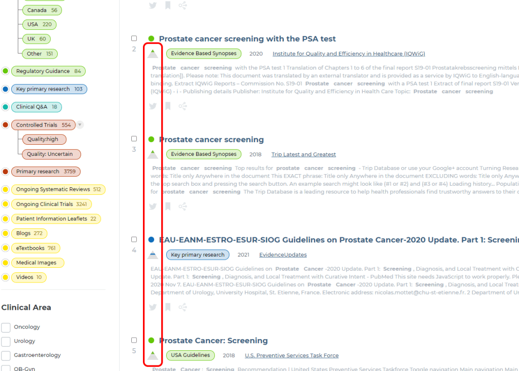
Currently Trip allows two main ways of governing search sensitivity. The default (sensitive) is to search title and text. The more specific mode is ‘title only’ (matching search terms to words in the document title).
Problem – sometimes the default can be overly sensitive returning low relevancy results or, if using the ‘title only’ too specific.
Proposed solution – To introduce three levels of searching:
- Title only
- Title and full text
- Title and abstract
The default could be to the mid-level ‘title and abstract’ (but we would introduce an easy mechanism to ‘show more’ or ‘show fewer’ results). We believe this will be a sweet spot of relevancy (for most users) and reduce the sometimes overwhelmingly high number of results.
IDEA TWO – start to use citation data
Document linkage can be very useful in easily identifying articles that are related to the ones you are interested in. We exploit these linkages – in the form of clickstream data – in our SmartSearch and related articles features. This is fine but is limited in certain respects.
Problem – identifying linked articles is problematic and means users have to look through many results to find articles similar to the ones they have found already. Users may give up after a page of results missing lots of really good articles on the next pages.
Proposed solution – to introduce citation data.
Citation data would dramatically increase our ability to link articles. This could enhance our SmartSearch feature. So, if a user clicks on articles #1 and #5 we could identify more, closely related articles, that are relevant to their search intention. Another use could be highlighting the relationship between RCTs and systematic reviews. So, if you find an RCT we could link it to systematic reviews it might have been used in. Conversely if you find a systematic review we can highlight the individual RCTs.
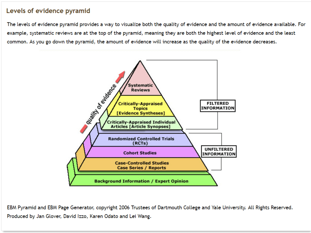
IDEA THREE – quality scoring
Problem – Trip is an EBM search engine and we like to connect users to the best available evidence. However, just because something is linked to from Trip it doesn’t mean it’s not without flaws.
Proposed solution – we currently, using RobotReviewer, automatically assess if RCTs are likely to be of low risk of bias or not. We have done most of the work to assess guidelines for how evidence-based they are. We have also started some preliminary work to assess systematic reviews for bias and could develop this further.
IDEA FOUR – search support
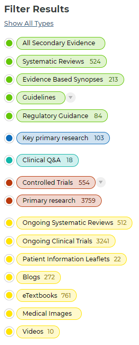
Currently Trip allows users to search and then restrict the search by evidence type, clinical area, year etc. But is this set-up in an efficient way and does it support users to find what they need?
Problem – users might not be able to find the documents they needs as quickly as possible.
Proposed solution (1) – introduce an additional category of filters based on clinical question type e.g. therapy, diagnosis
Proposed solution (2) – introduce a step-by-step search guide to really allow users to focus their results. It might have the following steps:
- User types search terms
- We potentially suggest additional terms and user finalises search
- We ask if the user wants a particular type of evidence
- We then ask if there is a particular recency they’re interested in
- If it’s a query about diagnosis, therapy
- If there’s a particular clinical area
At each step we show the number of results and when the user is happy we show the results. It’s sounds long-winded but it should be quick and should deliver really focussed results.
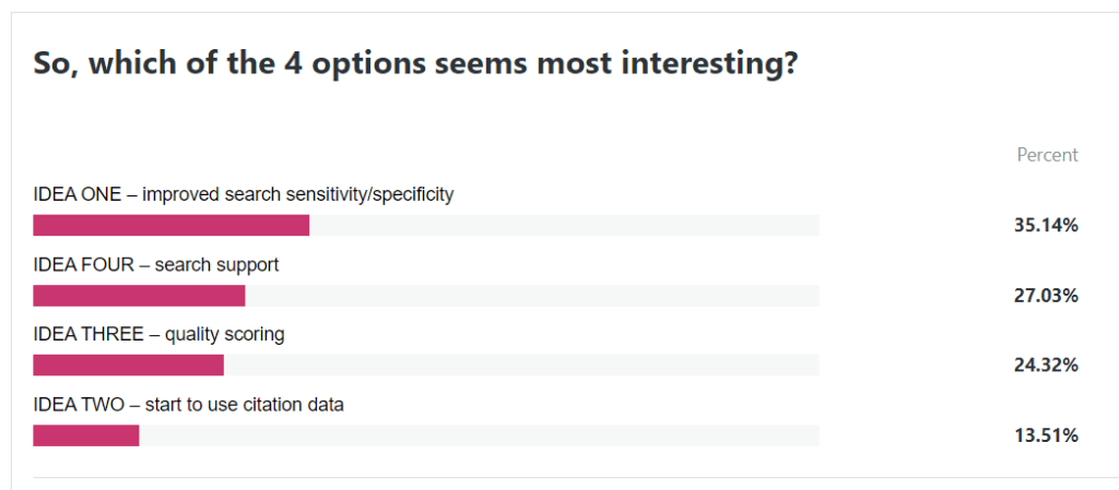
So, it’s now over to you to let us know what you think. Please use the poll below (or let us know any alternatives you may have):

Recent Comments